Friday, September 30, 2011

Vintage Magnolia Santa


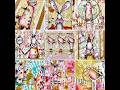
I made this card for the 12 Tags of Christmas Funkie Junkie Style Challenge. Each week for 12 weeks, Linda is posting a tag to use as inspiration. Participants do not have to create a tag. They can create a tag, card, art piece - anything at all. The only requirement is to use something from the posted tag as inspiration for whatever you create. I'm a little behind. The challenge is on week 4 and this is my project for the week 1 inspiration. Good thing we have until December 15 to link all 12 of the projects. I had a hard time getting started. At first I thought I wanted to create one big overall project, such as an altered book, and have each week's project be a part of that larger project. But I couldn't figure out what I wanted to do or what I would really do with it once I was finished. For me, the things I make also need to be practical. So in the end, I decided to just make whatever I was inspired to make for each week's inspiration and not try to have everything come together in one piece. I may make a card, a tag, a gift card holder, an ornament or whatever.

You can see Linda's inspiration tag for the week 1 challenge here on her blog. For this week's challenge I chose to make a card. The inspirations from Linda's tag are:
  • Vintage
  • Santa
  • Kraft + 1 color (I used red instead of green)
  • Gold accents
  • Paper rosette behind the sentiment

My Santa image is from Magnolia and I colored him with Prismacolor pencils blended with Gamsol. The Be Merry sentiment is stamped with Fired Brick Distress Ink and cut out with a Nestabilities label die. I hand-stitched around the outside of the background with fine gold cord. The "Grand Christmas" piece is part of a Boston toy store advertisement that I downloaded from The Graphics Fairy. I inked everything with Vintage Photo Distress Ink and sprayed with a homemade glimmer spray made from Vintage Photo Distress Ink and Aztec Gold PearlEx powder. Some of the mist came out in bigger droplets than I would have liked. To finish it off, I added some red gems, gold sheer ribbon, a paper rosette and a stick pin.

I'm looking forward to doing more projects for this challenge. I really admire Linda's work. Thanks for looking!

Tuesday, September 27, 2011

Vintage Collage Birthday Card

I made this card for my dear friend Susan's birthday. I am also entering it in the Catered Crop Follow the Recipe Challenge. This is another newly discovered challenge blog for me and my first submission. The idea of this challenge is that the winner of the previous challenge provides the "recipe" for the next challenge (theme, papers, tools, etc.) You can choose any ingredient or ingredients from the recipe and add your own "spice" to make a new creation. Looking at the inspiration recipe and mine, I may have used more of the inspiration ingredients than I realized and not so much of my own spices, but I still am very happy with how this card turned out. It was a lot of fun to make.

Here is my recipe:
Colors: Sepia, Blues, Browns, Gold
Papers: Design paper (My Mind's Eye - I think :); dictionary page; shipping tag; scraps
Stamps: harlequin, sentiment, scroll (on twill tape)
Color Mediums: Distress Ink (Vintage Photo, Walnut Stain, Antique Linen), homemade glimmer spray (distress ink mixed with PearlEx powder and water)
Embellishments: Twill tape, lace, twine, buttons, beads, jewelry tag, thread, vintage clipart
Techniques: Tea dye, distress, sewing
Tools: die cuts, punches
Themes: Vintage, bird, birdcage, birthday

A few notes:
I soaked the gingham background paper in tea to give it an aged look. It was very bright before I did that.

The blue flower is made using the Martha Stewart Hydrangea punch. I punched it twice, pressed on the petals with a stylus to curl them and stacked the six pieces together to make the flower. I used a gold seed bead for the center.

The white flower is made from crepe paper. I colored it with a homemade glitter spray, then die cut the petals with a Nestabilities die. I layered them with regular white glue and puffed up the layers. I added three gold seed beads for the center. I really enjoyed working with the crepe paper. it's thin so you can manipulate it, but not as delicate as tissue paper. I got a big roll of white for less than a dollar and I can color it with inks or whatever to get the color I want. Pretty good buy.

The bird and birdcage images are from the awesome Graphics Fairy blog. If you like vintage images you should check it out. It has tons of cool stuff for free.

Thanks for looking!

Sunday, September 25, 2011

Autumn Blessings

This is my first fall-themed card this year. I love, love, love fall. It's hands-down my favorite season of the year. I love the cooler temperatures (our summers are very hot and humid), the clear blue sky and the crispness in the air. We've already had some cool days. We even had to turn our heat on for a little while today.

I'm submitting this card for two challenges - the weekly challenge on the CardMaker Card Swap forum and the Stampin' Sisters in Christ Challenge #108.

For the CardMaker challenge this week, Rhonda challenged us to make a fall card without using any fall-theme designer paper. Instead she wanted us to create our own background paper. I decided to try a new technique (for me) to make my background paper, but as often happens it didn't turn out right.

What I wanted to do was the Alcohol Ink Faux Bleach technique. With this technique, you stamp an image with Versamark on white glossy cardstock then heat emboss it with clear. You sponge the alcohol inks all over the paper, then cover the image with a piece of plain white cardstock and iron over it to remove the embossing. The image you stamped then shows in white with the alcohol ink colors on the rest of the piece. The technique was beautiful in the demo video I watched, but mine - not so much. I think maybe my stamp was too detailed and didn't quite get stamped all the way either. Soooo - I just made my background by sponging the fall color alcohol inks all over the paper and I think that turned out pretty well.

On top of my background I made six little fall theme squares. In the upper left is a square punched from my failed background technique. The pumpkin in the next square is cut from a vintage seed packet image that I dowloaded from The Graphics Fairy (awesome site for FREE vintage images!). For the next square I sprayed a piece of cheesecloth with some homemade glimmer spray made from Vintage Photo Distress Ink and Aztec Gold PearlEx powder. I love the look of these sprays but never wanted to pay the prices for the ready-made stuff. You can search for "homemade glimmer mist" on YouTube for how to make this. It's super easy. I then punched three leaves from the background paper left from trimming down my piece and glued them on top of the cheesecloth.

In the lower left corner is a stamped sunflower that I colored with watercolor pencils, sponged on a little Vintage Photo Distress Ink and cut it out. Next is my sentiment, which I printed on the computer. I added a little stamped leaf and a flower with a little button and some twine, then sponged on an little of the Vintage Photo ink. The final square is another square punched from my faux bleach image. After I had everything glued to the background paper, I sprayed the whole thing with some of the homemade glimmer spray.

The theme for this week's Stampin' Sisters in Christ challenge is to use the word "blessings" or a piece of scripture on your card. I just found this challenge blog a couple of weeks ago and this is my first time to participate in the challenge. They post wonderful inspirational stories with their challenges and I am happy to have found a challenge that also helps me profess my Christian faith. I'm looking forward to getting to know and fellowshipping with other women who share my faith and my passion for stamping and paper crafting.

Thanks for looking!

Friday, September 23, 2011

Altered Book Calendar Februrary 2012

I am participating in The Craft Barn's 12 Week Calendar Challenge. Each week has a different theme and each day one member of the design team posts their take on the theme. You can make one calendar creating a month each week or you can create multiple calendars with the full year on each one. I have decided to make my calendar in an altered children's board book. This is my first altered book project and so far it's a lot of fun - but very time consuming.

I was not able to complete my January page in time to meet the challenge deadline last week, so I'm starting with February. I decided to get that month done so I could try to meet the deadline this week. I'll go back and finish my January page and post it later.

This week's challenge was to use the color red and heat embossing. I painted the page with dark red acrylic paint. I stamped the background of the page with a script stamp and attempted to emboss it in cream. That was a disaster. I don't know if it was because I was stamping on a painted surface or because the page wasn't laying flat, but I could not get a good stamp anywhere. I tried to fill in thinking it would just end up adding to the distressed look anyway, but it just was a mess. Fortunately most of the mess got covered up with everything else. I had no way to salvage it other than to just trash it and I didn't want to do that. Lesson learned. I also embossed the same script on the little pocket. That turned out much better. The frame behind the calendar is a piece of chipboard cut with my Labels Nestie. I inked the edges and embossed them in gold. I also embossed the wings on the heart.

The tag in the pocket is to write important dates, such as birthdays. I also thought I could tuck little notes or appointment cards, etc. in the pocket.

Thanks for looking!

Sunday, September 11, 2011

We Will Never Forget

This is my little tribute to today's somber anniversary of the 9/11 terrorist attacks. It's hard to believe it's been 10 years. This was not only a horrible day for my beloved country, but for the whole world as everyone mourned along with us.

I started this little collage just because I wanted to do it. I wanted to do something to honor the day and I also wanted to try something new. I have never made anything like this before. I have been wanting to try some mixed media collage and thought this would be something I could practice on. I didn't intend to submit it for any challenges or anything. But shortly after I started this project yesterday, Hels Sheridan, who publishes the Ink on My Fingers blog, posted her Sunday Stamper challenge. The theme this week is The Time to Remember commemorating the 9/11 attacks. So I have decided to submit it for that challenge.

I just recently discovered Hels' blog. She is not only a talented artist, this lady is a hoot! Even if you aren't particularly into her artistic style, you should check out her blog. She never fails to make me laugh. I think she would be a delightful person to know.

I started my collage by making the background. First I tore some random pieces of paper in shades of red, blue and tan and glued them onto a piece of scrap paper with Mod Podge. After that dried, I went over the whole piece with Walnut Stain Distress Ink to get rid of the white edges of the paper and tone down the colors a bit. Then I stamped the clock and script randomly on cream color tissue paper using brown StazOn, tore it into pieces and glued them over the paper, again using Mod Podge. It wrinkled a bit and some of the distress ink showed through, which I decided I liked. After the background piece dried, I glued it to a 6x6 piece of chipboard and trimmed it to fit. I then brushed metallic antique gold acrylic paint around the edges and in random strokes across the piece.

I downloaded the "We the People" and the vintage lady graphics from Flickr (Creative Commons License). I hand-stitched the lady onto a piece of vintage dictionary paper with the definition for "free" at the top. I created the Bible verse on the computer, tore it out and inked it with Vintage Photo and Fired Brick Distress Inks. I made the rosette and added the button, twine, stick pin and star charm. I stamped "Remember 9-11-01 Forever" using Fired Brick Distress Ink, then finished it off with an old postage stamp (it says "Give me liberty or give me death.") and three copper upholstery tack brads. I'm not sure about the brads, but it looked like it needed some dimension on that side and I couldn't find anything else to put there. I may change that part later if I find something more appropriate.

As I mentioned above, this is my first mixed media collage and I loved making it as much as I thought I would. I know I still have a lot to learn, but it turned out even better than I had hoped it would. I got a little scared when I was making the torn paper background. It looked pretty bad in it's first stages, but I kept going and it turned out great. I'm definitely going to do more of that and more mixed media art.

Thanks for looking!

Supplies
Stamps: Clock (Rosebud); Script (Club Scrap); Numbers (Technique Tuesday); Remember and Forever (Unknown)
Ink: Walnut Stain, Vintage Photo and Fired Brick Distress Ink (Tim Holtz - Ranger); Saddle Brown (StazOn); Red Pepper Alcohol Ink on the button (Ranger)
Paper: Scraps from my stash and tissue paper
Other: Vintage images (Flickr), vintage postage stamp, Metallic Antique Gold acrylic paint (Folk Art); stick pin; star charm; button; twine; upholstery tack brads (Making Memories)

Friday, September 9, 2011

Gluttonous Gruffie

Still making progress on my return to crafting. This time I not only stamped my image - I even colored it. It sure seems like it took a lot longer than it used to, but it's my first coloring attempt for quite awhile, so I guess I'm not surprised. I'm submitting this chocoholic Gruffie for the following three challenges:

CardMaker Magazine Forum - Trash to Treasure
Crafty Creations - Anything but a Square
Colour Create - Pink, Brown and Cream or White; Optional - Lace

This week's "anything goes" challenge on the CardMaker forum is Trash to Treasure. The challenge is to use a candy wrapper or other food packaging that you would usually discard on a card. I paper-pieced (actually foil-pieced) the truffle wrappers that the Gruffie has discarded with pink foil from a Hershey Kiss. I found them at my mom's house and I think they must have been left from Valentine's Day. I also made my ginormous flower (at least it looks ginormous because the card isn't very big) with the paper wrappers from six miniature Reese's Peanut Butter Cups. The center of the flower is fancy button from my stash. By the way, paper piecing with foil from Hershey Kisses is a royal pain.

To meet the requirement for the Crafty Creations challenge I cut the card with my largest Labels Nestie. I folded the card stock in half, then left the left edge of the die hanging just off the fold so it wouldn't cut that side. I really like the way it looks, but I wish I had a bigger die like that. It's only a little over 5" x a little over 4". Not a lot of room to do much, especially with the large image. I could have made a rectangle that would have been larger, but I didn't want a straight shape.

This week's Colour Create challenge is pink, brown and cream/white. There is also an option of using lace. I used all shades of pink and brown to color the image, except for the gold metallic pen that I used for the word "Truffles" on the box. My papers and embellishments are also the required colors. I used a lace ribbon on the left side. I also used a clear Glaze pen on the truffles to make them look kind of shiny. I'm not sure if that shows very well in the photo.

It was fun to color again and fun to make a challenge card again. Thanks for looking!

Supplies
Stamp: Beary Full of Truffles (Gruffies - House Mouse Designs)
Paper: pink card stock (scrap from my stash), brown card stock (Club Scrap), DP (My Mind's Eye)
Ink: Onyx Black (VersaFine); Jet Black (StazOn); Vintage Photo Distress Ink (Tim Holtz - Ranger)
Technique: Prismacolor pencil blended with odorless mineral spirits
Misc: Labels Nestabilities die (Spellbinder); lace, button, Reese's papers and Hershey Kiss foil

Tuesday, September 6, 2011

Vintage Stamped Collage

I made this card for this week's sketch challenge on the CardMaker Card Swap forum. I am not completely thrilled with it. Collage is one of my favorite stamping techniques, but I think I am a bit out of practice since it's been at least two years since I've done one (probably longer). It didn't turn out quite like I wanted it too. I wanted to see how it looked to tint a couple of the images, which I have never done before. I used chalks just to give a little color. I don't think I'll be doing that again - or if I do I'll just color them sepia tones. Also it didn't exactly fit the sketch. I probably should have made a bigger card to have more room below the diamond to put the ribbon.

I did try a couple of new things. I made my own background paper out of a page from an old book that I picked up for free from a box at the library. I applied packaging tape to the page, then stripped it off to remove some of the lettering. Then I wet the page down with coffee, crumpled it and flattened it out to dry. I then stamped swirls on it using Vintage Photo Distress ink. I think I need to work on it a little more (too many swirls and not enough enough color from the coffee), but overall I liked it. I'm on a much more restricted crafting budget than I used to be so I'm always looking for ways to recycle and make my own things so I don't have to spend a lot of money. Since I love shabby and vintage, this is a good technique for me.

For the flower embellishment, I stamped some script on the top flower with the distress ink (which kind of got covered up with the button). I also decorated the button. I used the back side of a plain white button so it would be smooth. I dabbed it with Latte alcohol ink to color it, then I stamped a tiny argyle pattern on it with Timber Brown Staz-On. On top of that, I stamped a tiny fleur de lis with Blazing Red Staz-On. Unfortunately, that pretty much got covered up by the bow. I still count it as a success because now I know my huge stash of plain ol' buttons has tons of new possibilities with my alcohol inks and little stamps. I have a feeling I'm going to go crazy with this one. :) I also made the stick pin and colored the pearl on the end with the Latte alcohol ink.

Even though this card didn't turn out quite like I wanted it to, it was a success for me. I learned a few new techniques and ways to stretch those crafting dollars. Plus, I finally got to use my stamps again. Thanks for looking!

Supplies
Stamps: Stampabilities, Hampton Art, Rosebud, Penny Black, Impression Obsession, Inkadinkado, Club Scrap
Ink: Vintage Sepia (VersaFine); Timber Brown, Blazing Red (StazOn); Tim Holtz Vintage Photo Distress Ink (Ranger); Latte Adirondak Alcohol Ink (Ranger)
Paper: Scraps from my stash; old book page
Diamond Cookie Cutter die (QuikCutz); ribbon, Prima flowers, button, twine, red fiber, stick pin

Friday, September 2, 2011

C'mon Honey, Cowgirl Up!

Here is the card I made for this week's "Anything Goes" challenge on the CardMaker Magazine Card Swap Forum. The theme was to use newsprint. As is usually the case, the card did not end up as I had originally planned. I guess I should stop thinking of them as plans and start thinking of them as starting points.

The newsprint is from an article about bull riding that was in our monthly rural electric cooperative newspaper. This led me to a western theme. Since the boot image is really the only western theme stamp I have, I decided to see if I could find a vintage cowboy image online and I thought the phrase "cowboy up" would be a good sentiment. While I did find some cowboy images, I really liked the one of the cow"girl" that I decided to use. Obviously, I had to change the sentiment, but that's just the way life works out for me most of the time.

I stamped and distressed the newsprint to give it some interest. I also inked the edges of the card and the photo. The sentiment is computer generated. I embellished with jute twine, a copper heart charm and embossed metal photo corners, which I made myself.

To make the photo corners, I cut the top and bottom off an aluminum soda can, then cut it open lengthwise to make a sheet. I stuck it inside an embossing folder and ran it through my Big Kick so that the silver side was embossed. Then I colored it with alcohol inks. I cut small squares with a Nestabilities die, then punched two of the corners into a scroll shape. I cut the squares in half into two triangles to finish them. I was very happy with the way they turned out and now I'm trying to think of what else I can make with soda cans. Sure beats going out and buying metal sheets at the craft store. You do have to be careful with embossing. Because the metal is thin, the grooves can be weak and the metal might break if you bend them in those areas.

Thanks for checking out my card!

Supplies
Paper and Cardstock: Scraps from my stash and newsprint
Stamps: Old Boot (Stamabilities); swirl (Hampton Art)
Vintage cowgirl image (public domain image downloaded from the Internet)
Font: Honey Script (downloaded from daFont.com)
Ink: Tim Holtz Vintage Photo Distress Ink (Ranger); Rust, Terra Cotta and Pitch Black Adirondak alcohol inks (Ranger)
Nestabilities square die (Spellbinders); Corner punch (EK Success); Victorian embossing folder (Cuttlebug); jute twine; copper heart charm